In today’s fast-paced digital world, more than 60% of web traffic comes from mobile devices, and this number is growing each year. A website that looks great on a desktop but fails on mobile can cost you customers, credibility, and revenue. Responsive website design ensures your website works seamlessly on every device—be it a laptop, smartphone, or tablet. For businesses in 2024, a responsive website isn’t just an option; it’s a necessity to stay relevant and competitive.
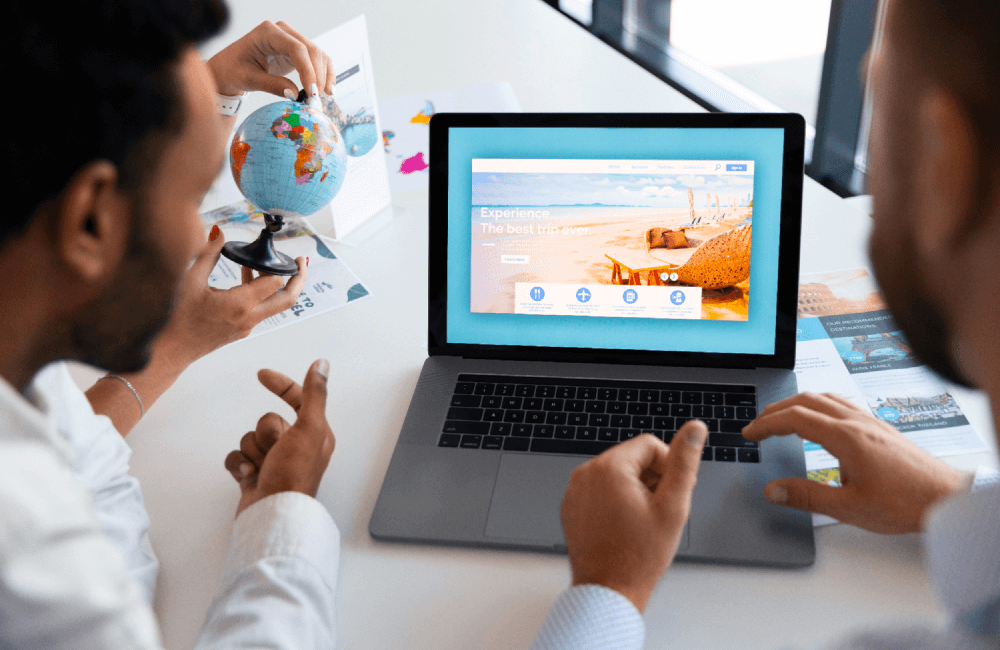
What is Responsive Web Design?
Responsive web design is a development approach that ensures a website’s layout and content automatically adjust to fit any screen size or resolution. Whether your visitors are on a small smartphone screen, a tablet, or a widescreen desktop, responsive websites provide a consistent and enjoyable user experience.
Responsive design uses flexible grids, media queries, and scalable images to achieve this fluidity, making your site functional and aesthetically appealing on all devices.
Benefits of Responsive Web Design
Enhanced User Experience
When users can easily navigate your website, read content, and interact with features on any device, they’re more likely to stay longer. A positive user experience boosts customer trust and engagement.
Improved SEO Rankings
Search engines like Google prioritize mobile-friendly websites. Having a responsive site increases your chances of ranking higher on search engine results pages (SERPs), leading to greater organic traffic.
Cost-Effective Solution
Instead of building separate websites for desktop and mobile users, responsive design allows you to manage one site that works on all platforms. This saves time, resources, and maintenance costs.
Higher Conversion Rates
Mobile users account for a large share of e-commerce sales. If your site isn’t responsive, users will leave and look elsewhere. A mobile-optimized site drives more conversions and sales.
Future-Proof Your Website
With new devices and screen sizes emerging constantly, a responsive website adapts effortlessly, ensuring your site stays relevant for years to come.
Webyte’s Approach to Responsive Web Design
At Webyte Web Design Agency, we understand that a responsive website isn’t just about resizing—it’s about delivering the best experience to your users. Our approach includes:
User-Centered Design: We study your audience’s behavior to craft responsive designs that cater to their needs.
Testing Across Devices: We rigorously test each site on various devices and screen resolutions to guarantee seamless performance.
Performance Optimization: A fast-loading site is key. Our team ensures your website remains responsive without sacrificing speed.

